The Colors On My Palette
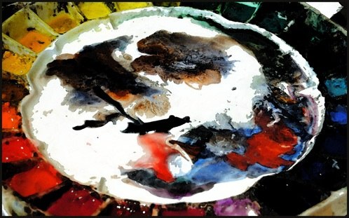
My ceramic watercolor palette has thirty-two paint wells. Although it’s fun to explore the attributes of the thousands of paint colors available to artists, I’ve found that by limiting myself to thirty-two choices, I’m free to paint spontaneously without searching through a box of paint, squinting to read the tiny printed pigment info every time I need another color. Consequently, I now find myself on a never-ending quest to find the thirty-two essential paints that I can’t live without.
One of the first things I decided when I began assembling my roster of thirty-two paints was that I’d try to limit my choices to single pigment paints. Convenience mixtures, or paint derived from combinations of pigments, tend to look muddy as soon as you begin mixing them with other colors. They aren’t good team players. If you’re a convenience mixture you have a slim chance of making my team, although there are always those that defy the odds. While painting Looking For The Easy Life, for example, I discovered that I couldn’t live without a convenience mixture that goes by the name Hooker’s Green. I liked its nickname and found it indispensable for painting tropical foliage, so now it’s a permanent member of the squad.
Another attribute I require from my paint is permanence. Sorry Alizarin Crimson, you’re out. No exceptions here. I sell many of my original book illustrations and don’t want them fading after a few years of hanging in someone’s living room.
After those two attributes the selection process gets a little murkier. Take Cerulean Blue and Quinacridone gold for example. Cerulean blue is a mainstay on my palette because I love its opacity, how it lifts from the paper and granulates when applied wet into wet. But on the other hand, I love Quinacridone gold for the opposite reasons. It makes beautiful, smooth and translucent washes that stain the paper.
There are other instances when a color makes the cut because of its leadership traits and willingness to be a team player. Raw umber is one of those colors. By itself it’s an unremarkable brownish yellow, but it’ll do anything I ask it to do. If I say go over there and stand in that pile of pig poop and be a shadow, it’ll go over by the pile of pig poop and be a shadow. If I ask it to be the light emanating from a distant window, it’ll be the light emanating from a distant window. Raw umber sets a good example for the other colors.
A good backstory can also help a color make my team. While painting my latest book; Turkey Trick or Treat, I was faced with the challenge of painting night scenes and I found myself looking for more dark colors than the ones on my palette. One of the colors I found myself regularly reaching for was Prussian blue.
So I did a background check.
Interestingly, I learned that Prussian blue was the first modern synthetic pigment. It was accidentally invented in 1706 by a German pigment and dye producer named Johann Jacob Diesbach. While attempting to create a red lake pigment from the cochineal insect, he instead obtained a blue as a result of the contaminated potash he was using. He borrowed the potash from his alchemist friend Johann Konrad Dippel, who had previously used it to produce "animal oil"— proof that borrowing potash and experimenting with weird bugs with your alchemist friends isn’t always such a bad idea. I’m still not sure if Prussian blue will make the team, but its fun backstory doesn’t hurt its’ chances.
Anyway, for my fellow color geeks out there, below is a complete list of the thirty-two colors currently on my palette. I’ve included the alphanumeric pigment names because — as you already know if you’re a true color geek — the common names are virtually meaningless.
PB16 (Phthalo Turquoise)
PG7 (Phthalo Green Blue)
PG18 (Viridian)
PG36 (Phthalo Green Yellow)
PG36, PY110 (Hooker’s Green)
PY129 (Rich Green Gold)
PY37 (Cadmium Lemon)
PY97 (Hansa Yellow Medium)
PY150 (Nickle Azo Yellow)
PY 110 (Isoindoline Yellow)
PY37 (Cadmium Yellow Deep)
PY42 (Yellow Ochre)
P049 (Quinacridone Gold)
PBr7 (Natural Sienna)
PBr7 (Raw Umber)
PBr7 (Burnt Umber)
PO73 (Pyrrol Orange)
PO48 (Quinacridone Burnt Orange)
PBr7 (Burnt Sienna)
PR254 (Pyrrol Red)
PR108 (Cadmium Red Deep)
PR177 (Anthraquinoid Red)
PR179 (Perylene Maroon)
PR122 (Quinacridone Magenta)
PV14 (Cobalt Violet)
PV23 (Dioxazine Violet)
PO73 + PB29 +PG18 (Shadow Violet)
PB15 Phthalo Blue + PV19 Quinacridone Violet + PBk6 Lamp Black (Payne’s Gray)
PB29 (Ultramarine Blue)
PB15 (Phthalo Blue Red)
PB28 (Cobalt Blue)
PB35 (Cerulean Blue)
Monday, March 9, 2015